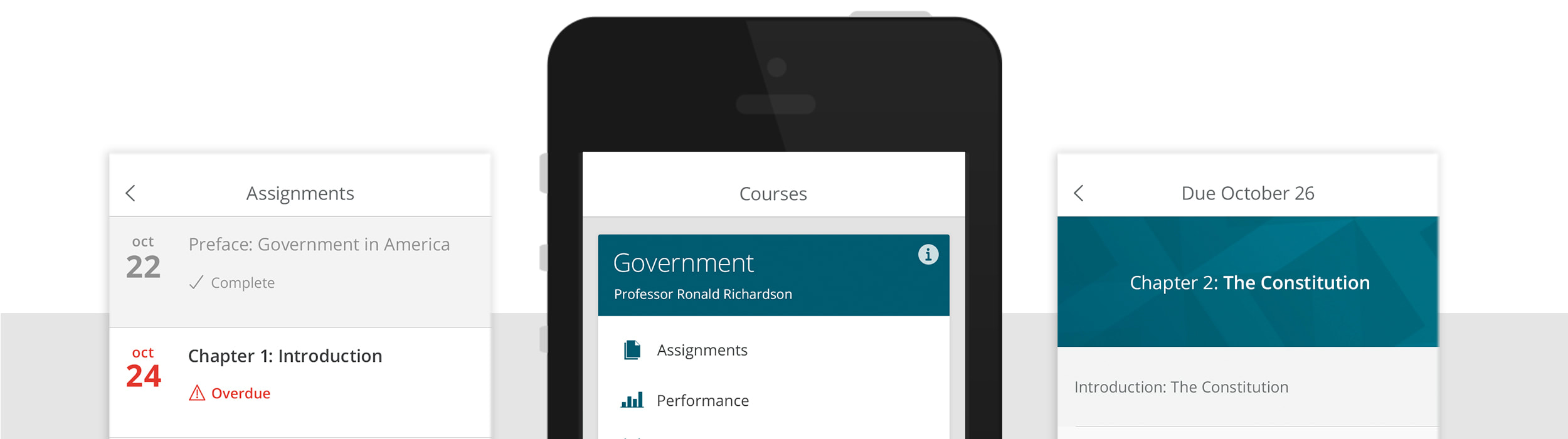
Pearson Revel Mobile App
Role UI / UX Design Company Pearson Project Mobile Application
Objective |
Challenge |
|
Rebrand the existing Revel desktop product, and empower students to read, study, practice, test, and complete coursework all from a mobile application.
|
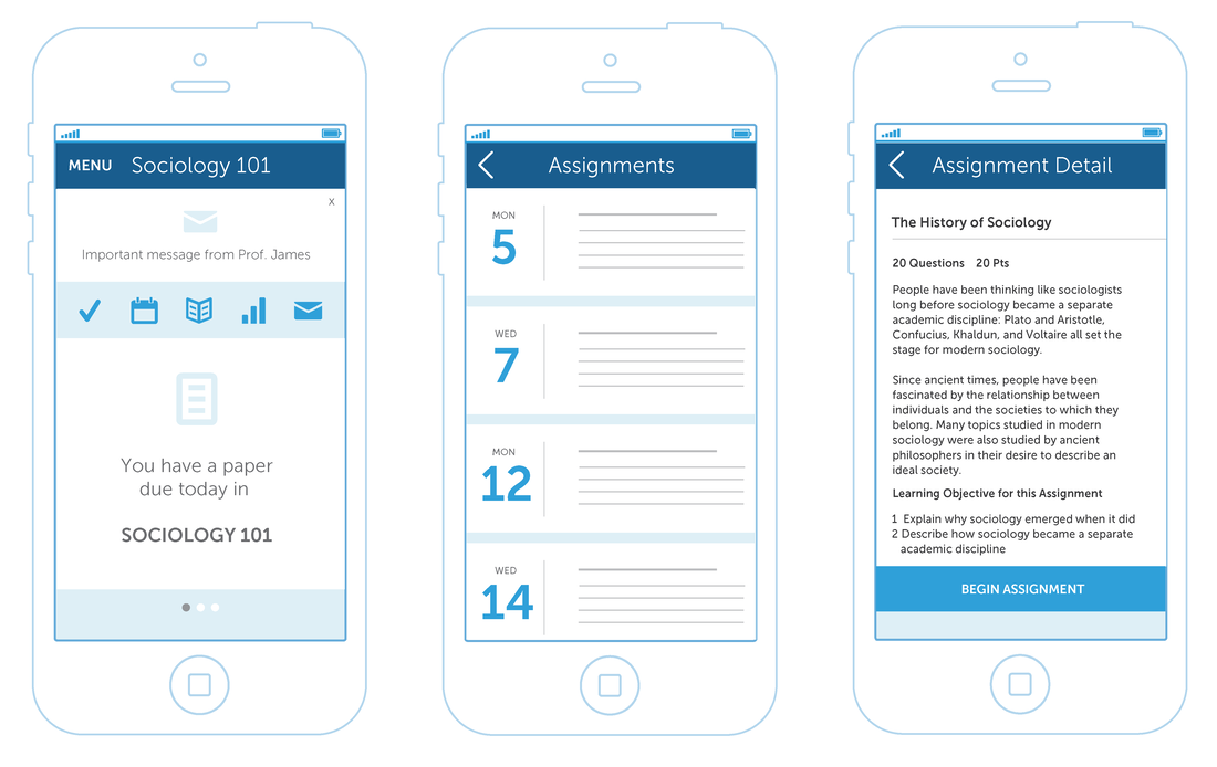
Revel was a legacy product at Pearson that was created without a UX team. It looked dated and was difficult to use. We needed to create a modern product that students trusted and worked for their educational needs.
|
UX Process
|
Our design team worked tirelessly on a 6-month product rebrand, traveling around the country to interview stakeholders and host design workshops. We also held extensive interviews with students on campus to discuss their behaviors, wants, and needs. Once the rebrand was well-defined, we decided to do a 3-day, iterative user testing session with our research team to accommodate a quickly-approaching school-year calendar timeline. By the end of the third day, we had a really solid, usable product that had been refined multiple times before we designed the rest of the UI.
|
Approach |
Overall Outcome |
|
Being this was the 4th or 5th, yet largest, mobile application our design team had worked on in a short timeline, we used user testing feedback and re-purposed many of the screens we had used for other application to design Revel mobile. We were able to apply the new brand to hundreds of screens to create an end-to-end mobile experience. We worked with UX teams across the US to collaborate and create a universal mobile component library.
|
The final application was a huge hit across colleges that had been using the legacy Revel website. Students loved the mobile capabilities and ease-of-use. The application was well-received by new students and professors as well. Revel was beautiful, clean, but most importantly, useable. Sales rose for the Revel application and new colleges adopted the mobile product.
|
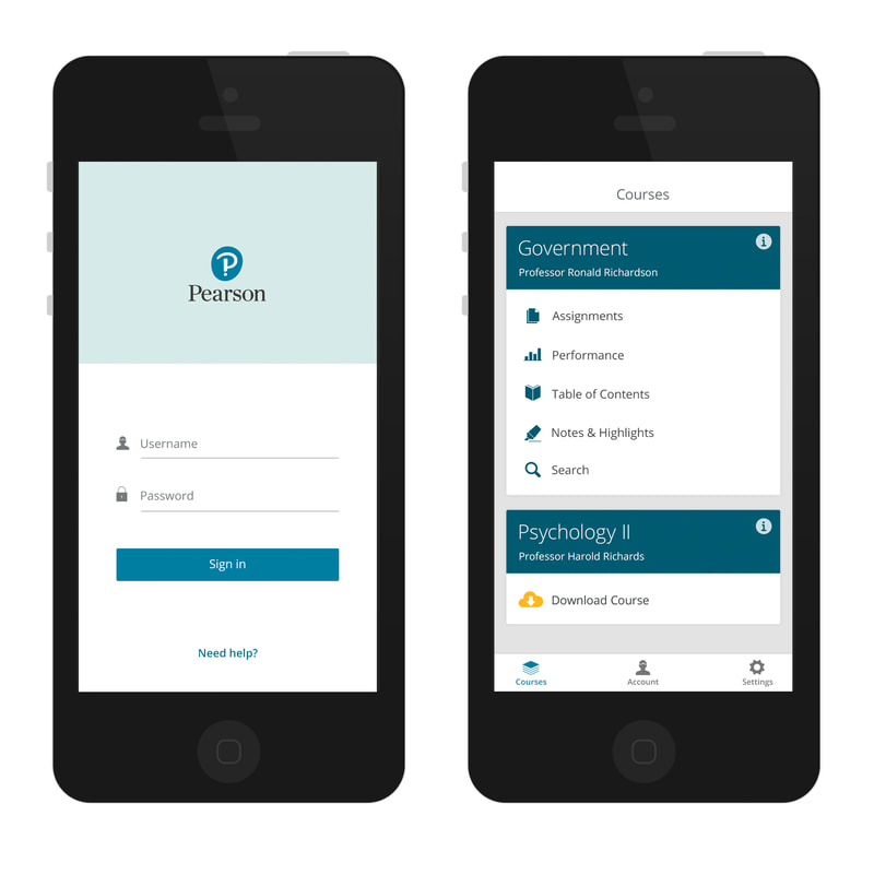
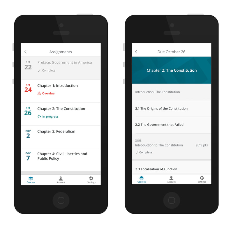
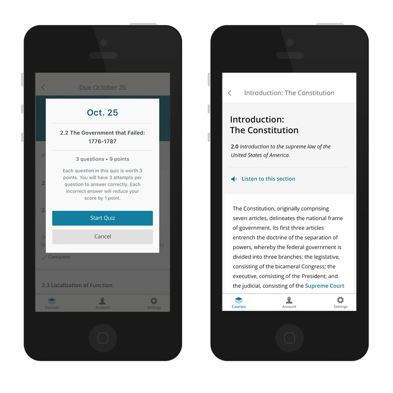
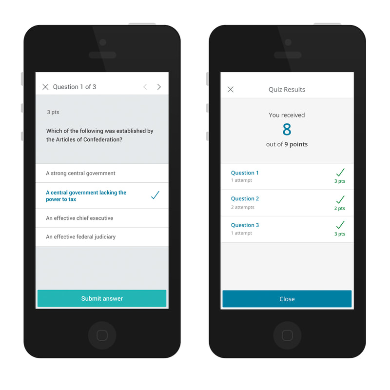
Final Designs